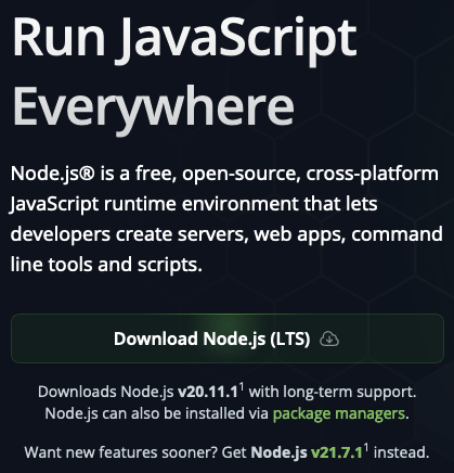
Bringing this over from a conversation on Mastodon:
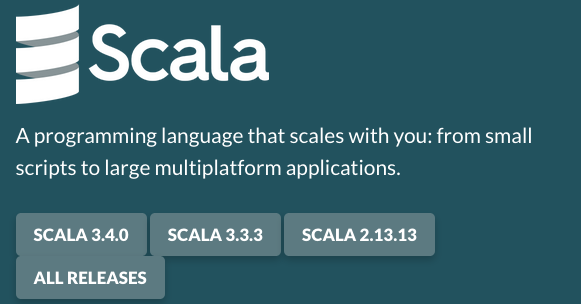
The Scala homepage offers you links, right at the top, to download 3.4.0, 3.3.3, or 2.13.13. Nowhere there does it point out that, for most people, what you want is 3.3.3.
Even when you click into them, the only difference is that the 3.3.3 page says “LTS” (in one place, with no explanation) and 3.4.0 doesn’t. Folks, that’s jargon – moreover, it’s inside-baseball jargon that only some software communities use and junior engineers tend not to know. It sort of tacitly assumes that the reader is familiar with Java idiom, which is an assumption we shouldn’t be making. We need to explain it, not assume the viewer knows it.
The reality is that, if you want to dive into Scala for the first time, or start a serious project, 3.3 is probably what you currently want – 3.4 is more for the folks who like having fun out at the edge of language development. We should make that much clearer on the front homepage.
(Yes, I’m pondering what this ought to look like, but I’m also aware that I’m by no means a UX specialist, and my CSS is weak – there are undoubtedly people, hopefully some involved with the Scala Center, with a better sense of this stuff. My guess is that 3.3.3 should be first, and larger, with the other two below it, and hover text or small subtitles with one-liners of why you would want each.)


