Nitpick, but can we get a UI/UX designer to work on the Scaladoc style.
Not that I think it’s ugly, and I’m not the best person to comment on this, but I believe it might have some issues.
One is the lack of colors in text heavy pages: It’s just a mix of grays and blacks, so things like links and monospace text (I’m not talking about code snippets) don’t really pop out, making the text a bit hard to follow…
Maybe having some indicator near external links could also help.
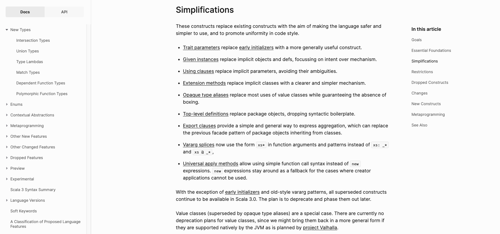
Another is the left-side pane… There’s just so much irrelevant information there…
Maybe a localized search bar or some different grouping strategy would help?
Compare this with MDN:
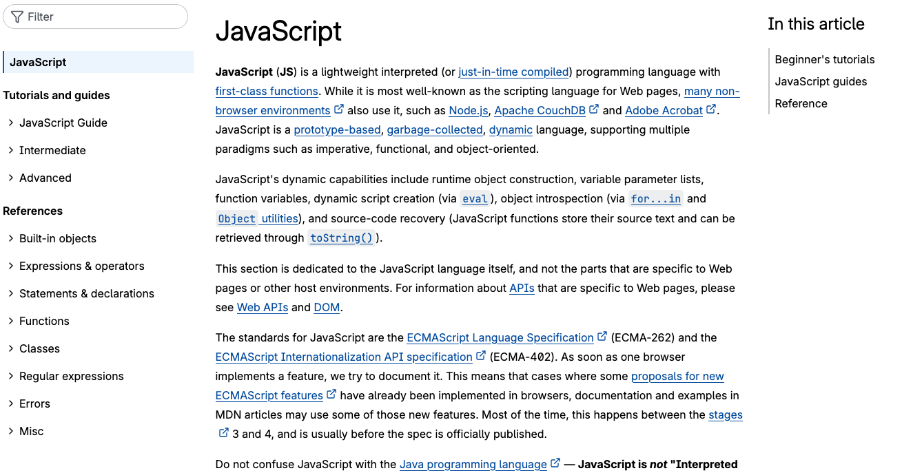
Text is colorful, external links are correctly pointed out, implementation references are collapsed (similar to packages) but are automatically expanded when you use the filter function.